As an example, let’s add a black stroke to a text. I will start with some HTML code:
<span class="stroke-text">STROKE TEXT</span>
And the CSS code:
.stroke-text{
  -webkit-text-stroke:5px black;
  -webkit-text-fill-color:transparent;
}
Pretty straight forward, we make the text transparent – though this is not necessary, but I only want to the outline of the text to be visible and not the body of the letters. Then,
the -webkit-text-stroke property
adds a black outline stroke 5px thick. You can change this to get thicker outline text or a thinner outline, depending on what effect you want to obtain.
The good news:
You can use this to stroke text in CSS on all Webkit based browsers (like Chrome or Edge) and Firefox too.
The bad news:
This is a non-standard feature, so not something you can rely 100%.
It’s not supported on all browsers and according to CanIUse.com: this property does not yet appear in any W3C specification. Was briefly
included in a spec as the text-outline property,
but this was removed.
Just to give you a hint of what you can create with this text stroke CSS property, here’s my Cyber Space text effect part of the 80s fonts text effects gallery.
Adding Stroke To Text Using text-shadow
Another method to outline text in CSS is by using shadows. CSS allows adding multiple shadows to a text element via the property text-shadow.
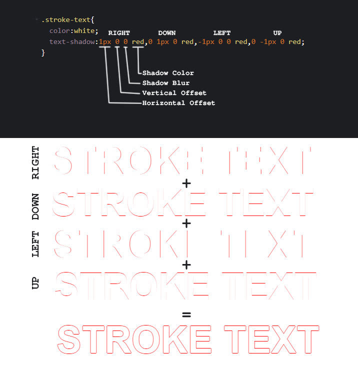
So, let’s make a white on white text and add 4 red shadows to it. Offset the 4 shadows by 1px up, left, down and right. Here’s the HTML code:
<span class="stroke-text">STROKE TEXT</span>
and the CSS code:
.stroke-text{
  color:white;
  text-shadow:1px 0 0 red,0 1px 0 red,-1px 0 0 red,0 -1px 0 red;
}
Here’s a graphical representation of what’s going on and how the CSS text stroke effect is achieved using text shadows:
Perfect, isn’t it?
Well, not exactly, but pretty damn good. Let’s point out some draw backs and solutions for it.
First, if we need to modify the text outline thickness or color we need to change it in multiple places, and this can be tedious.
CSS offers us quite an elegant solution which I use quite often for convenience and that is CSS variables. You can read more about CSS variable here, but what you need to know is that if you in your CSS you have to repeat values over and over again, CSS variables are a tremendous help.
Using CSS Variables To Configure The Text Stroke Color And Thickness
Basically you define a CSS variable like this: --my-variable:value.
Then, throughout your CSS code if you need that value simply use property:var(--my-variable);
So, change the CSS code above like this:
.stroke-text{
  --stroke-color:red;
  --stroke-width:1px;
  color:white;
  text-shadow: var(--stroke-width)  0 0 var(--stroke-color),
    calc(var(--stroke-width) * -1) 0 0 var(--stroke-color),
    0 var(--stroke-width) 0 var(--stroke-color),
    0 calc(var(--stroke-width) * -1) 0 var(--stroke-color);
}
The --stroke-color variable
stores the color for the text stroke and --stroke-width stores
the width of the stroke. Then in the text shadow we use those variables. This allows making changes only in one place if we were to modify the color or the width of the text stroke.
Pretty neat, isn’t it?
In the text-shadow property,
I’ve made use of the CSS calc function
to allow me to multiply the text stroke width by -1 for the up and left shadow directions.
If you start playing around with this and change the thickness of the text stroke you will notice that for larger values, something is wrong at the corner of the letters.
And so we come to our second draw back:
We see some breaks in the text stroke because we are only using 4 shadows that we shift on 4 directions.
So, what should we do to fix this?
The answer is simple: add more shadows!
Hang on to your hats kids and take out your math notebooks. This is a “Definitive Guide to Stroke Text” after all, so we need to be thorough.
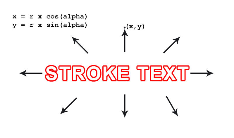
If we add more shadows to our text, we need to figure out how to shift those shadows around our text to cover all the gaps in the text outline. Intuition says that we should spread them evenly on a circle with a radius equal to the width of the text stroke.
And, intuition is right!
To calculate the offsets of the shadows we use the polar coordinates formulas:
x = r * cos(alpha)
y = r * sin(alpha)
Where x and y are
the offset values, r is
the radius of the circle (actual amount that we want to offset by which translates into the thickness of the text stroke) and alpha is
the angle by which we want to divide the circle into.
We can assign values to alpha depending
on how many shadows we want to add to create our text stroke.
For example, for 8 shadows we divide 2*PI (the full circle) by 8 and we get an angle of PI/4. Then if we assign values to alpha with
a step of PI/4 like 0, PI/4, PI/2, … until we complete the circle, we should get our 8 shadows offsets perfectly aligned on a circle.
The more shadows we add, the smoother the CSS text stroke becomes for larger values of the stroke width. There are no trigonometric function in CSS yet, so we need to calculate the values ourselves.
Let’s modify the HTML and CSS code to add a smooth text stroke with 16 shadows:
<span class="stroke-text smooth-16">STROKE TEXT</span>
and add the CSS for the smooth text stroke:
.smooth-16 {
  text-shadow: calc(var(--stroke-width) * 1) calc(var(--stroke-width) * 0) 0
      var(--stroke-color),
    calc(var(--stroke-width) * 0.9239) calc(var(--stroke-width) * 0.3827) 0
      var(--stroke-color),
    calc(var(--stroke-width) * 0.7071) calc(var(--stroke-width) * 0.7071) 0
      var(--stroke-color),
    calc(var(--stroke-width) * 0.3827) calc(var(--stroke-width) * 0.9239) 0
      var(--stroke-color),
    calc(var(--stroke-width) * 0) calc(var(--stroke-width) * 1) 0
      var(--stroke-color),
    calc(var(--stroke-width) * -0.3827) calc(var(--stroke-width) * 0.9239) 0
      var(--stroke-color),
    calc(var(--stroke-width) * -0.7071) calc(var(--stroke-width) * 0.7071) 0
      var(--stroke-color),
    calc(var(--stroke-width) * -0.9239) calc(var(--stroke-width) * 0.3827) 0
      var(--stroke-color),
    calc(var(--stroke-width) * -1) calc(var(--stroke-width) * 0) 0
      var(--stroke-color),
    calc(var(--stroke-width) * -0.9239) calc(var(--stroke-width) * -0.3827) 0
      var(--stroke-color),
    calc(var(--stroke-width) * -0.7071) calc(var(--stroke-width) * -0.7071) 0
      var(--stroke-color),
    calc(var(--stroke-width) * -0.3827) calc(var(--stroke-width) * -0.9239) 0
      var(--stroke-color),
    calc(var(--stroke-width) * 0) calc(var(--stroke-width) * -1) 0
      var(--stroke-color),
    calc(var(--stroke-width) * 0.3827) calc(var(--stroke-width) * -0.9239) 0
      var(--stroke-color),
    calc(var(--stroke-width) * 0.7071) calc(var(--stroke-width) * -0.7071) 0
      var(--stroke-color),
    calc(var(--stroke-width) * 0.9239) calc(var(--stroke-width) * -0.3827) 0
      var(--stroke-color);
}
For convenience, I’ve created a JS function that generates the stroke text CSS code depending on how many shadows you want to have. Here’s the code:
/*
text-shadow from smooth-16 was created with steps = 16
*/
function calculateStrokeTextCSS(steps) {
  var css = "";
  for (var i = 0; i < steps; i++) {
    var angle = (i * 2 * Math.PI) / steps;
    var cos = Math.round(10000 * Math.cos(angle)) / 10000;
    var sin = Math.round(10000 * Math.sin(angle)) / 10000;
    css +=
      "calc(var(--stroke-width) * " +
      cos +
      ") calc(var(--stroke-width) * " +
      sin +
      ") 0 var(--stroke-color),";
  }

  return css;
}
Run this function with steps=16 and
you will get the CSS value for the text-shadow property. Please note that this JS code does not have to be part of the page where you display the CSS stroke text. Here’s the Codepen snippet
with where you can play with the code:
Now we have two perfectly valid methods for creating CSS stroke text, but since this is a definitive guide I will not stop here and I will show you a couple of extra alternatives for creating a text outline with CSS shadows.
QUICK TIP: This exact same method works for creating outline images from PNG images for example.
Add Stroke To Text Using CSS SVG Filters
If you don’t know about SVG filters or what you can do with them I strongly suggest you read this article about 80s fonts and SVG filter text retro effects. WARNING: prepare to be amazed 😎
Basically, you can define SVG filters that you can then use in CSS with the filter property.
In one of my recent articles I’ve made heavy use of CSS filters to create CSS image effects. But, in our case we will use SVG / CSS filters to add stroke to a text.
Here’s the HTML code along with the SVG filter definition:
<span class="stroke-text">STROKE TEXT</span>

<svg version="1.1" xmlns="//www.w3.org/2000/svg" xmlns:xlink="//www.w3.org/1999/xlink" style="display:none;">
  <defs>
    <filter id="stroke-text-svg-filter">
      <feMorphology operator="dilate" radius="2"></feMorphology>
      <feComposite operator="xor" in="SourceGraphic"/>
    </filter>
  </defs>
</svg>
and the CSS code:
.stroke-text{
  color:dodgerblue;
  filter:url(#stroke-text-svg-filter);
}
which renders a blue outlined text like this:
So, how does this work?
Well, the stroke-text-svg-filter SVG
filter we apply to our text has two steps:
-
feMorphologywithdilatetakes the original text and “dilates” or enlarges the text in all directions by aradiusof 2 pixels -
feCompositewith theoperator="xor"performs a XOR operation which actually subtracts from the enlarged text the original text, such that we are left with a hollow text or outlined text
Change the thickness of the text stroke you have to modify the radius attribute
in the SVG filter. To change the color of
the text stroke, simply change the color CSS property in the stroke-text class.
This SVG filter also works for PNG images.
The only downside for this method of adding stroke to text is that the end result looks a bit coarse for bigger values of the radius.
This is because the dilation algorithm tries to expand the letters in all directions which means that it might not render a true outline which should be equally sized in all directions.
Here’s the Codepen for adding stroke to text with SVG filters:
SVG Text Outline
Besides SVG filters, we can create the text outline using SVG text and CSS specific for SVG.
Though not exactly an HTML and CSS only solution, this solution probably creates the best looking text outline effect.
To create a text outline with SVG and CSS here’s the SVG code that you add in your HTML page:
<svg version="1.1" xmlns="//www.w3.org/2000/svg" xmlns:xlink="//www.w3.org/1999/xlink" width="100%">
  <text class="stroke-text" x="50%" y="50%">SVG STROKE TEXT</text>
</svg>
and the CSS code:
.stroke-text{
  font-size:100px;
  text-align:center;
  text-anchor:middle;
  stroke:dodgerblue;
  stroke-width:3px;
  fill:none;
}
To quickly go over the code, the text SVG STROKE TEXT is added as an SVG text right in the middle of the SVG object (therefore the 50% set for the x and y).
The CSS code that actually controls the color and width of the text stroke or the text outline are the 2 CSS properties stroke and stroke-width.
Please note that these properties will only work on SVG elements and NOT on HTML elements.
To create the multiple text stroke effect, just add a couple of extra <text> elements,
offset them a bit and change the stroke color.
Create Double Outline Font Effect Or Multiple Outline Font Effect With SVG Stroke
While you’re on it, you should know that can also create some really cool double or multiple outline font effect with just a couple of modifications to the code above.
Simply add multiple text elements
in the SVG with different stroke values
in the CSS. Be careful to start with the thickest stroke and go on with thinner and thinner stroke values because the text elements will be placed on top of each other to form the multiple
outline font effect.
Here’s the HTML code for the double font effect and the multiple font effect:
<svg version="1.1" xmlns="//www.w3.org/2000/svg" xmlns:xlink="//www.w3.org/1999/xlink" width="100%" height="200">
  <text class="stroke-text thick color1" x="50%" y="50%">DOUBLE OUTLINE FONT</text>
  <text class="stroke-text" x="50%" y="50%">DOUBLE OUTLINE FONT</text>
</svg>

<svg version="1.1" xmlns="//www.w3.org/2000/svg" xmlns:xlink="//www.w3.org/1999/xlink" width="100%" height="200">
  <text class="stroke-text thicker color1" x="50%" y="50%">MULTIPLE OUTLINE FONT</text>
  <text class="stroke-text thick color2" x="50%" y="50%">MULTIPLE OUTLINE FONT</text>
  <text class="stroke-text color3" x="50%" y="50%">MULTIPLE OUTLINE FONT</text>
</svg>
As you see I’ve added each effect in it’s own <svg> element.
And the CSS code goes like this:
.stroke-text{
  font-size:80px;
  text-align:center;
  text-anchor:middle;
  stroke:dodgerblue;
  stroke-width:4px;
  fill:none;
}

.thick{
  stroke-width:8px;
}

.thicker{
  stroke-width:12px;
}

.color1{
  stroke:magenta;
}

.color2{
  stroke:yellow;
}

.color3{
  stroke:red;
}
If you’ve reached this far, congrats! You’re now a CSS stroke text Jedi!
Want to be a Jedi master and know everything about CSS stroke text? Continue reading.
HTML5 Canvas Text Outline
I know I’ve said this before, but this article is meant to be a definitive guide to stroke text. That is why I decided to include ALL methods for creating stroke text or text outline in HTML, even without CSS.
Yes, it is possible to create outlined text using the HMTL5 canvas.
Let me show you how to do it!
First, let’s setup the canvas with the following HTML code:
<canvas id="myCanvas" width="850" height="300"></canvas>
Then, using JavaScript let’s draw the outlined text like this:
var myCanvas = document.querySelector("#myCanvas");
var ctx = myCanvas.getContext("2d");

ctx.strokeStyle = "red";
ctx.lineWidth = 3;
ctx.font = "70px sans-serif";
ctx.textBaseline = "middle";
ctx.textAlign = "center";
ctx.strokeText("CANVAS TEXT OUTLINE", myCanvas.width / 2, myCanvas.height / 2);
The important parts here are the strokeStyle and lineWidth settings
that set the color and the thickness of the text outline. The strokeText() function
does the actual drawing of the outlined text.
Here is the Codepen worksheet:
In Conclusion
I hope you found this article useful and worthy of being a true definitive guide to stroke text in CSS and not only. You now know more than one way to create stroke text or outline text in HTML, CSS and even HTML5 canvas.
If you know of alternative methods for creating stroke text in HTML and CSS please drop me a message and I’ll be happy to include it in this awesome and definitive guide!


