Discover the pivotal role of fonts and typography in movie posters. From captivating imagery to carefully chosen fonts, each element is meticulously crafted to convey genre, theme, and mood. Explore their power to captivate audiences, evoke emotions, and leave a lasting impression. Unravel the artistry behind movie poster typography and its integral part in the world of cinema.
If you want to create your own movie poster I highly recommend this complete guide on how to make a movie poster design online and free.
The Power of Visual Communication
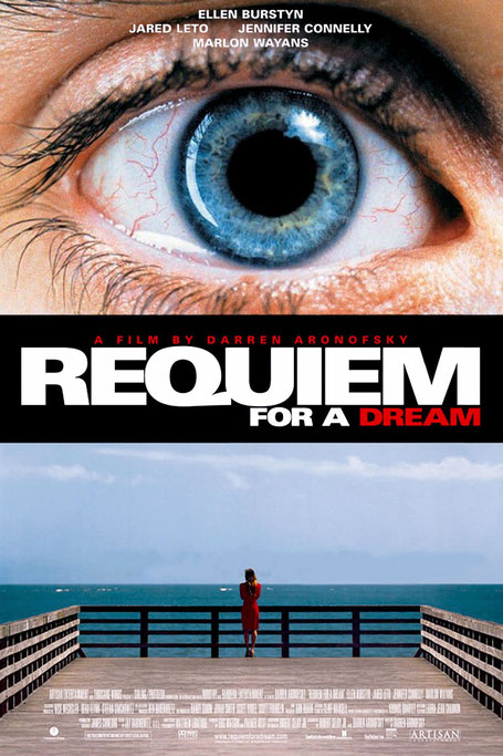
Visual communication holds immense power in the realm of movie marketing, as it has the ability to captivate and engage audiences on a deep emotional level. The combination of striking imagery, colors, and fonts in movie posters creates a visual language that speaks directly to viewers, arousing curiosity and enticing them to explore the film further.
Fonts play a significant role in the overall visual appeal of movie posters. The choice of font style, size, and arrangement can greatly impact how the poster is perceived. Bold, attention-grabbing fonts can create a sense of excitement and intensity, while elegant and sophisticated fonts can convey a sense of refinement and class. The right font can instantly convey the genre of the film, whether it be a horror movie with jagged, ominous letters or a romantic comedy with playful and whimsical typography. By carefully selecting fonts that align with the movie's themes and intended audience, movie posters can effectively communicate the essence of the film and pique the interest of potential viewers.
Typography, as a key element of visual communication, plays a crucial role in conveying key messages and setting the mood in movie posters. Beyond mere aesthetics, typography can evoke emotions, create intrigue, and establish a connection with the audience. The style, spacing, and arrangement of letters can subtly convey the tone of the film, whether it is dark and mysterious, lighthearted and comedic, or poignant and thought-provoking. The right typography can provide a glimpse into the storyline or hint at the central themes, leaving viewers intrigued and eager to uncover more. It serves as a powerful tool to establish the desired mood and elicit specific emotional responses from the audience.
In summary, visual communication in movie marketing is a potent force that can captivate and engage audiences. Fonts and typography play integral roles in this process, contributing to the overall visual appeal of movie posters and conveying key messages. With their ability to evoke emotions, set the mood, and pique curiosity, fonts and typography in movie posters form a powerful language that speaks directly to viewers, enticing them to explore the cinematic experience that awaits them.
Typography and Emotional Associations
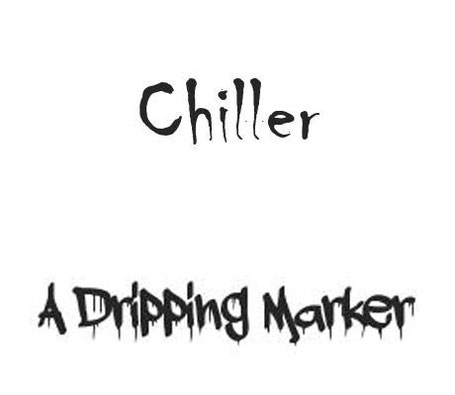
Typography plays a significant role in evoking specific emotions and associations in movie posters. Different font styles have inherent characteristics that elicit certain emotional responses from viewers. For instance, bold and angular fonts like Impact or Bebas Neue are often associated with strength, power, and action, making them suitable choices for movie genres such as action and thriller. On the other hand, elegant and flowing scripts like Edwardian Script or Allura can evoke a sense of romance and sophistication, making them ideal for romantic or period films. By understanding the emotional associations of different font styles, designers can strategically select fonts that align with the intended mood and genre of a movie, effectively communicating its essence to the audience.
The correlation between font choices and movie genres is a crucial consideration in typography for movie posters. Each genre has its own unique characteristics and expectations, and the typography used in movie posters can convey those genre-specific cues. For example, horror movie posters often employ distorted, jagged, or dripping fonts like Chiller or Dripping Marker to create a sense of fear and unease (scary fonts). Comedies, on the other hand, may utilize playful and whimsical fonts like Comic Sans or Amatic SC to evoke a lighthearted and humorous atmosphere. By carefully selecting fonts that align with the genre, movie posters can quickly establish an emotional connection with the audience and provide visual cues about the type of experience they can expect. This strategic use of typography enhances the overall effectiveness of the movie poster and helps attract the target audience by signaling the genre and setting appropriate expectations.
Check out this list of fonts from movies that you can download for free to if you are planning to practice creating your own movie posters.
Creating Memorable First Impressions

Creating a memorable first impression is paramount in the world of movie posters, and fonts play a crucial role in achieving this. The typography used in a movie poster is often one of the first elements that viewers encounter. It sets the tone, establishes the visual identity, and leaves a lasting impact on their perception of the film. The right font choice can instantly captivate the audience, pique their curiosity, and generate intrigue. Whether it's a bold and dynamic font that conveys excitement, or a refined and elegant font that exudes sophistication, typography has the power to make a movie poster stand out from the crowd and create a lasting impression that resonates with viewers long after they have seen it.
Analyzing the psychological impact of font choices on viewer perception unveils a fascinating aspect of typography in movie posters. Different fonts evoke distinct psychological responses, influencing how viewers perceive and interpret the film. Serif fonts, with their traditional and classic appearance, often convey a sense of trustworthiness and reliability. Sans-serif fonts, on the other hand, exude modernity and simplicity, creating a more contemporary and sleek impression. By understanding the psychological associations that fonts carry, designers can strategically choose fonts that align with the intended message, genre, and target audience of the film. This intentional use of typography not only engages viewers on a subconscious level but also shapes their initial perception of the movie, setting the stage for a compelling cinematic experience.
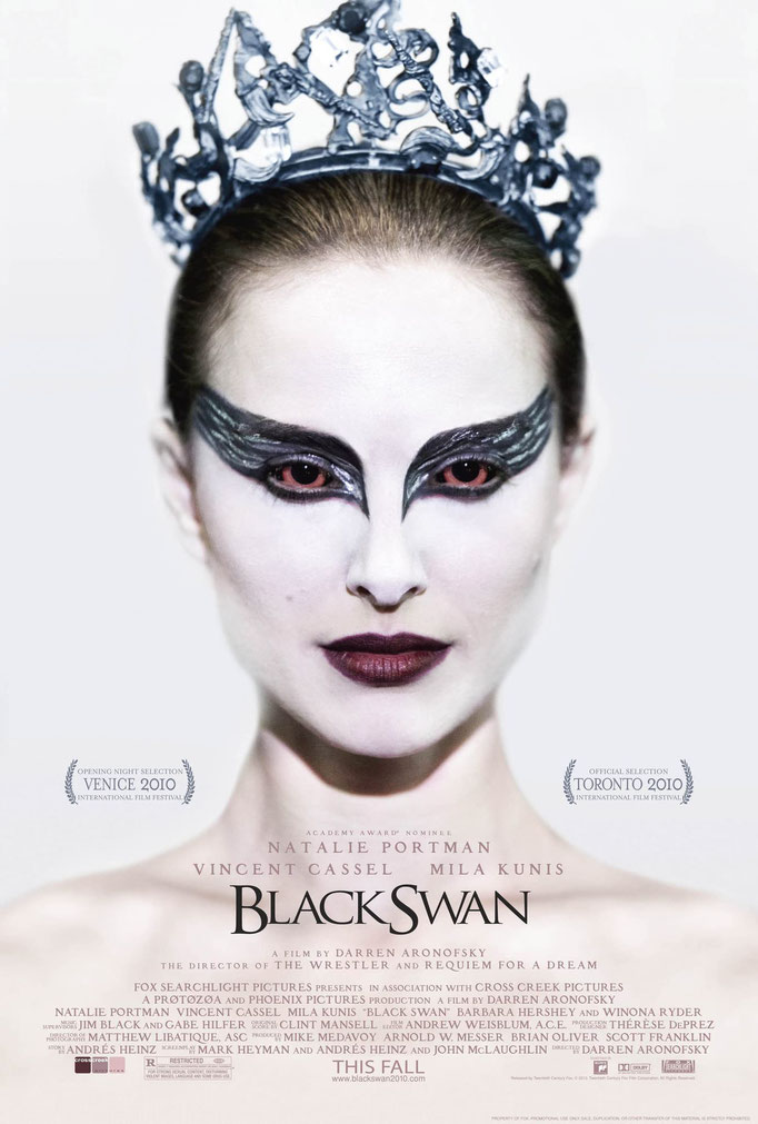
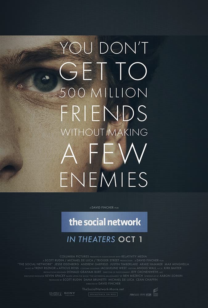
Showcasing movie posters with compelling typography that leave a lasting impact provides real-world examples of the power of fonts in creating memorable first impressions. From iconic movie posters that utilize unique and innovative typography to modern designs that push the boundaries of font selection, these examples demonstrate the ability of typography to leave a lasting imprint on viewers' minds. Whether it's the iconic comic book font of "Pulp Fiction" or the intricate, elegant and artistic lettering in "Black Swan", these movie posters showcase how typography becomes an integral part of the film's identity and contributes to its overall memorability. By showcasing these exceptional examples, we can further appreciate the artistry and impact of typography in creating captivating movie posters that leave a lasting impression on audiences worldwide.
The Art of Genre-Specific Typography

Typography in movie posters plays a pivotal role in establishing the genre of a film and instantly connecting with the audience. By analyzing font choices in different genres, we can gain valuable insights into the deliberate selection of typography to evoke specific emotions, set the tone, and shape audience expectations.
For example, horror movie posters often feature bold and distorted fonts, creating a sense of unease and fear. On the other hand, romance films opt for elegant and flowing scripts to convey passion and tenderness. Action movie posters utilize dynamic and bold fonts that exude strength and excitement. These deliberate typography choices effectively communicate the genre and allow viewers to connect with the film on an emotional level, attracting the target audience and shaping their cinematic experience. In summary, genre-specific typography in movie posters serves as a visual language that establishes the genre, engages the audience, and creates an immediate impact.
Case Studies: Memorable Movie Poster Typography
Conclusion
In conclusion, fonts and typography play a vital role in captivating audiences and establishing the genre of a film. The deliberate selection of fonts evokes specific emotions and sets the tone, leaving a lasting first impression on viewers. Genre-specific typography showcases the thoughtfulness behind font choices, shaping audience perception and creating anticipation.
Memorable typography movie posters exemplify the impact of carefully selected fonts in captivating audiences. Typography serves as a visual language, sparking curiosity and enhancing the overall cinematic experience. Its artistry and power should not be underestimated, as each chosen font contributes to the success of a film and leaves a lasting mark on viewers.
