
ORIGINAL ARTICLE: 5 Ways To Create A Triangle With CSS
Probably the easiest way to add a triangle in a web page is to simply draw it in an image and add the image to the web page. There are many secrets to drawing the perfect triangle and you can read how to do that in Photoshop in this article: Create A Triangle in Photoshop or download this free pack of triangle shapes for Photoshop.
In this post I will show you how to create a triangle with CSS & HTML.
Here’s an overview of the different methods I will use:
- Create a triangle using CSS
border - Create a triangle with CSS gradients (
linear-gradientandconical-gradient) - Create a triangle using
overflowandtransform - Create a triangle using
clip-path
Using border to
Create a Triangle in CSS
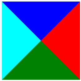
The following code will create a div with
4 triangles inside
HTML:
<div class="triangle"></div>
CSS:
            .triangle {
    border-left: 20px solid cyan;
    border-right: 20px solid red;
    border-bottom: 20px solid green;
    border-top: 20px solid blue;
    display: inline-block;
}
Results into
Making all borders transparent except the bottom border:
            .triangle-up {
    border-left: 20px solid transparent;
    border-right: 20px solid transparent;
    border-bottom: 20px solid green;
    border-top: 20px solid transparent;
    display: inline-block;
}
we get

How To Make An Equilateral Triangle Using border
CSS:
            .triangle-up-equilateral {
    --side-size: 20px;
    border-left: var(--side-size) solid transparent;
    border-right: var(--side-size) solid transparent;
    border-bottom: calc(2 * var(--side-size) * 0.866) solid green;
    border-top: var(--side-size) solid transparent;
    display: inline-block;
}

How To Create a Triangle Using CSS Gradients
CSS:
            .triangle {
    width: 200px;
    height: 200px;
    background: linear-gradient(to bottom right, #fff 0%, #fff 50%, green 50%, green 100%);
}
renders:

How To Create a Triangle Using CSS transform and overflow
CSS code:
            .triangle-element {
    width: 20px;
    height: 20px;
    overflow: hidden;
    position: relative;
    margin: 10px;
}
.triangle-element:after {
    content: '';
    background: green;
    width: 142%;
    height: 142%;
    position: absolute;
    transform: rotate(45deg) translate(-71%,0);
}

How To Create A Triangle In CSS Using clip-path
CSS Code:
            .triangle-element {
    width: 40px;
    height: 40px;
    background: green;
    clip-path: polygon(50% 0%, 0% 100%, 100% 100%);
}

Quick Tip: Did you know that you can also create triangles using plain text characters like these◄▲▼►? These are actually arrow characters that you can simply copy/paste into your HTML and create triangles. Check out this complete list of arrow symbol characters.
Conclusion
There are a lot of uses for triangles. From arrows to map pins, from menu markers to chart elements.
Now you know how to create a triangle with CSS.
If you liked this tutorial, make sure to check out our Complete How-To Guide for creating and using CSS Circle Images or see how to create a CSS only bar chart in HTML.